Reporting is the part of social media management that most people skip, rush through, or actively dread. You spent the month creating content, responding to comments, testing new formats, and optimizing posting times. Now you have to package all of that work into a document that proves it was worth the money. The irony is that the report — not the content itself — is often what determines whether a client renews your contract. A beautiful feed means nothing if the client cannot see the results in black and white.
The good news: building a great social media report is a learnable skill, not a talent. Once you have a solid template and a clear process, what used to take four hours drops to under one. This guide walks you through exactly what to include, how to structure it, and how to present data so clients not only read your report but look forward to receiving it.
Quick Answer
Key Takeaways
- The report is what clients use to judge your value — invest in it like a deliverable, not an afterthought.
- Every metric in your report should answer one question: "So what?" If you cannot explain why a number matters, remove it.
- Include month-over-month comparisons and trend lines — isolated numbers without context are meaningless.
- Lead with a one-page executive summary. Most stakeholders will only read this page, and that is fine.
- Separate data collection (automate this) from analysis (always write this yourself). The narrative is what clients pay you for.
- Match your reporting frequency to the client's decision-making speed: weekly for campaigns, monthly for ongoing management, quarterly for strategy.
Why Social Media Reports Matter More Than You Think
Social media reports are not just a formality. They serve three distinct purposes that directly affect your business relationships and your ability to do better work over time.
First, reports justify the investment. Whether you are a freelancer, an agency, or an in-house team, someone is paying for social media work. That person needs to see returns. A clear report that connects activity to outcomes makes the renewal conversation easy. A vague report — or worse, no report at all — forces the client to guess whether they are getting value. When clients guess, they usually guess low.
of agencies that lose clients cite 'lack of visible results' as the primary reason — not actual poor performance, but poor communication of performance. The report is your communication tool.
Second, reports build trust. When you proactively share what worked, what did not, and what you plan to do about it, you position yourself as a strategic partner rather than a task executor. Transparency about underperforming content shows confidence. Hiding bad numbers erodes trust the moment a client looks at their own analytics dashboard.
Third, reports make you better at your job. The process of reviewing a full month of data forces you to spot patterns you would miss in day-to-day posting. You notice that carousel posts outperform single images by 3x. You catch that Thursday afternoon posts consistently underperform. These observations, accumulated over months, compound into genuine strategic expertise. For more on which metrics to track and why, see our social media analytics guide.
Pro Tip
Schedule your reporting day on the calendar like a meeting. Block 60-90 minutes on the same day each month. When reporting has a dedicated time slot, it stops being the thing you rush through on Friday evening before a Monday client call.
What to Include in Every Social Media Report
Not every metric deserves a place in your report. Including too many numbers overwhelms readers and dilutes your key messages. The table below shows the core metrics that belong in nearly every social media report, what each one measures, and why it matters to clients.
| Metric | What It Measures | Why It Matters |
|---|---|---|
| Engagement Rate | Total interactions divided by reach or followers | Shows how compelling your content is relative to audience size |
| Reach | Unique users who saw your content | Indicates brand awareness and content distribution |
| Follower Growth Rate | Net new followers as a percentage of total | Tracks audience growth velocity, not just raw numbers |
| Click-Through Rate (CTR) | Clicks on links divided by impressions | Measures how effectively content drives traffic off-platform |
| Conversions | Desired actions taken (signups, purchases, downloads) | Directly ties social media to business outcomes and ROI |
| Top Content | Best-performing posts by engagement or reach | Reveals content themes and formats worth repeating |
| Saves & Shares | High-intent engagement actions | Strongest signal that content provided genuine value |
| Audience Demographics | Age, location, gender, active hours | Confirms you are reaching the right target market |
Use the engagement rate calculator to verify your engagement figures before including them. Small calculation errors in a report erode credibility fast.
Pro Tip
Apply the "So What?" test to every metric in your report. If you cannot complete the sentence "This number is [X], which means [Y], so next month we should [Z]," the metric does not belong in the report.
The Metrics That Actually Matter by Platform
Each platform has its own algorithm, content format, and user behavior patterns. That means the metrics that matter most differ by platform. Here is a breakdown of what to prioritize when reporting on each one.
| Platform | Primary Metrics | Secondary Metrics | What to Highlight in Reports |
|---|---|---|---|
| Engagement rate, saves, shares, reach | Story completion rate, Reel plays, profile visits | Carousel vs. Reel performance, save-to-like ratio | |
| Twitter / X | Impressions, engagement rate, link clicks | Retweets, quote tweets, profile clicks | Reply-driven conversations, viral amplification ratio |
| Impressions, engagement rate, CTR | Comment quality, follower demographics, document views | Lead generation, decision-maker reach, thought leadership engagement | |
| TikTok | Video views, watch time, shares | Completion rate, follower growth, comments | Average watch time vs. video length, virality rate |
| YouTube | Watch time, CTR (thumbnail), subscriber growth | Average view duration, traffic sources, Shorts performance | Audience retention curves, search vs. browse traffic split |
Tailor each section of your report to the platforms you manage. A client who only uses Instagram and LinkedIn does not need a TikTok section — even if you want to recommend expanding there. Save platform expansion conversations for the recommendations section, not the metrics overview.
Reports that include platform-specific context (not just raw numbers) are three times more likely to lead to strategy discussions during client calls. Context transforms data from a scorecard into a conversation starter.
How to Build Your Report Step by Step
Follow this five-step process to build a report that is both comprehensive and efficient to produce. After the first month, you will have a reusable template that reduces the work to under an hour.
Step 1: Collect and Organize Raw Data
Before you write a single word, pull all the numbers. Export analytics from each platform into a centralized spreadsheet or dashboard. Key exports include engagement metrics, follower counts, top posts, audience demographics, and website referral traffic from Google Analytics. Create a tab or section for each platform. Use consistent date ranges — always compare the same number of days to avoid skewed comparisons.
Step 2: Calculate Period-Over-Period Changes
Raw numbers in isolation are meaningless. For every key metric, calculate the change from the previous period. Use the formula: ((Current Period - Previous Period) / Previous Period) x 100. Present these as percentages with arrows or color coding: green for growth, red for decline, gray for flat. This gives clients an instant visual read on direction without needing to interpret raw numbers.
Step 3: Identify Top-Performing and Underperforming Content
Pull the top 3-5 posts by engagement rate (not just total likes) and the bottom 3-5. For each top performer, note why it worked: was it the format, the topic, the hook, the timing, or the visual style? For underperformers, note what might have gone wrong. This analysis is the most valuable part of the report because it directly informs next month's content strategy. Include screenshots or thumbnails of top posts so clients can see them without opening the platform.
Step 4: Write the Narrative and Insights
This is where your expertise shows. Write 3-5 paragraphs that explain the story behind the numbers. What trends emerged? Did an external event affect performance? Are there content themes gaining or losing traction? Connect platform performance to the client's broader business goals. A good narrative section answers: "What happened, why did it happen, and what does it mean for us?"
Step 5: Add Recommendations for the Next Period
End every report with 3-5 specific, actionable recommendations. These should flow directly from your analysis. "Carousel posts outperformed single images by 47% this month — I recommend shifting our content mix to 60% carousels next month." Vague suggestions like "keep posting good content" waste space. Each recommendation should have a clear rationale and a measurable expected outcome. This section is what separates a data dump from a strategic report.
Pro Tip
Number your recommendations and reference them on next month's report. "Last month we recommended increasing carousel posts (Rec #2). This month, carousels made up 55% of content (up from 30%) and engagement rose 23%." This creates accountability loops that clients love.
Free Social Media Report Template Walkthrough
Here is the exact template structure we recommend. You can build this in Google Slides, Canva, Notion, or even a well-formatted Google Doc. The key is consistency — use the same structure every month so clients know where to find what they need.
Page 1: Executive Summary
This is the single most important page. Many stakeholders will only read this. Include: a one-sentence overview of the month ("March was our strongest month for engagement, driven by the product launch series"), 3-4 key metrics with period-over-period change arrows, your single biggest win, your single biggest challenge, and one headline recommendation. Keep it to half a page of text maximum.
Page 2-3: Metrics Dashboard
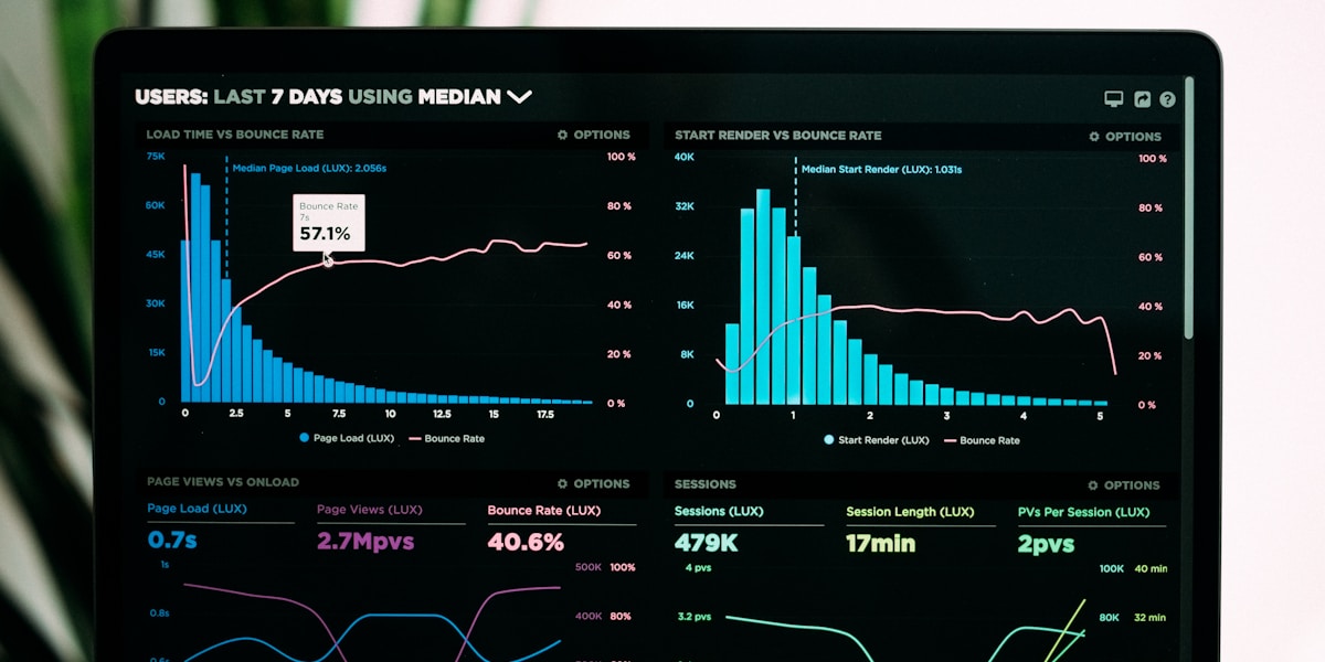
Present your core KPIs in a clean grid layout. Use large, bold numbers for current values with smaller percentage changes below. Organize by category: Awareness (reach, impressions), Engagement (engagement rate, saves, shares), Growth (followers, email signups), and Conversion (CTR, website visits, leads). Include a simple trend line chart showing the last 3-6 months for each primary metric. This visual context is worth more than any single month of data.
Page 4-5: Platform Breakdowns
Dedicate one page per platform (or half a page for lower-priority platforms). Each breakdown should include: platform-specific metrics, top 3 posts with screenshots and engagement data, audience growth chart, and one platform-specific insight. Use a consistent layout across platforms so the eye knows where to look.
Page 6: Content Performance Analysis
Create a table or grid showing performance by content type (video, carousel, static image, text post, story). Include columns for: number of posts, average engagement rate, average reach, and total clicks. This quickly reveals which formats are working and which should be reduced or eliminated.
Page 7: Insights and Recommendations
Three to five insights drawn from the data, each with a corresponding recommendation. Format these as paired blocks: "Insight: Video content reached 2.3x more people than static posts this month. Recommendation: Increase video content from 20% to 40% of the content mix in April." Close with a brief look-ahead section noting upcoming events, campaigns, or tests planned for next month.
For inspiration on what content to plan around these insights, check out our guide to building a social media content calendar.
of clients say a clear executive summary is the most valuable page in a social media report. If you only have time to polish one section, make it the first page.
How to Present Data So Clients Actually Read It
A report full of raw numbers in dense paragraphs will go unread. Data presentation is a skill that separates amateur reports from professional ones. Here are the techniques that work.
Use Visual Hierarchy
The most important numbers should be the largest on the page. Use 24-32pt font for headline metrics and 12-14pt for supporting details. Color-code direction: green for positive changes, red for negative, and neutral gray for flat results. This lets clients scan the report in 30 seconds and get the overall picture before reading a single sentence.
Benchmark Against Something
A 4.2% engagement rate means nothing unless compared to something. Always include at least one comparison point: last month's number, an industry benchmark, the client's own target, or the platform average. "Engagement rate: 4.2% (up from 3.1% last month, above the 2.5% industry average)" — now the client knows 4.2% is great without needing to ask.
Use Trend Lines, Not Just Snapshots
A single month of data is a data point. Three months of data is a trend. Six months is a story. Always include at least a 3-month trend line for your primary metrics. This context prevents overreaction to natural month-to-month fluctuations and helps clients appreciate gradual, sustained growth that might not be obvious from a single data point.
Lead with Insights, Not Numbers
Instead of "Reach: 145,000 (up 12%)" as the heading, try "Our reach grew 12% this month, driven by two viral Reels." Lead with the human-readable interpretation, then support it with the number. This subtle shift makes the report feel like strategic counsel rather than a spreadsheet dump.
Pro Tip
Use screenshots of actual top-performing posts in your report. Visual proof of success is more persuasive than any metric. Clients who see their brand's content performing well feel emotionally invested in the work, not just analytically convinced.
Monthly vs Weekly vs Quarterly Reports
Choosing the right reporting cadence depends on the client, the budget, and the pace of decision-making. Here is a comparison to help you pick the right frequency.
| Factor | Weekly | Monthly | Quarterly |
|---|---|---|---|
| Best For | Active campaigns, product launches, crisis monitoring | Ongoing social media management, most client relationships | Executive summaries, board presentations, strategic reviews |
| Depth | Surface-level pulse check (1-2 pages) | Detailed analysis with insights (5-8 pages) | Deep strategic review with trend analysis (8-15 pages) |
| Audience | Internal team, hands-on marketing managers | Direct client contacts, marketing directors | CMOs, founders, executive stakeholders |
| Time to Produce | 15-30 minutes | 1-2 hours | 3-5 hours |
| Key Focus | Quick wins, anomalies, urgent adjustments | Performance trends, content analysis, tactical recommendations | Strategic direction, ROI analysis, competitive landscape |
| Format | Email or Slack message with bullet points | PDF or slide deck with data visualizations | Formal presentation deck with narrative arc |
The most effective cadence for most freelancers and agencies is monthly reports with optional weekly pulse updates. The weekly pulse is a quick Slack message or email with 3-5 bullet points: top post, total reach, any anomalies, and one observation. It takes five minutes and keeps the client engaged between formal reports.
Quarterly reports layer on top of monthly ones. Aggregate three months of data, zoom out to identify larger trends, and include competitive analysis or industry benchmarking that would be overkill in a monthly report. Quarterly reports are also the right place for strategic pivots and budget discussions. Align your reporting rhythm with your overall social media strategy for maximum coherence.
Common Reporting Mistakes That Make You Look Unprofessional
Even experienced social media managers make these errors. Avoid them and you will immediately stand out from the majority of reports clients receive.
1. Including metrics without context. A number by itself — "Reach: 87,400" — tells the client nothing. Is that good? Bad? Better than last month? Always pair every metric with a comparison point and a brief explanation.
2. Using inconsistent date ranges. Comparing a 31-day month to a 28-day month without normalizing creates false narratives. Use consistent date ranges or normalize to per-day averages for fair comparisons.
3. Hiding bad results. If engagement dropped 15%, say so and explain why. Clients who discover bad numbers on their own lose trust fast. Proactively addressing underperformance with a plan actually builds more confidence than pretending it did not happen.
4. Drowning the report in data. More metrics does not equal a better report. If your report has more than 15 distinct metrics, you are overwhelming the reader. Prioritize ruthlessly. Most clients care about 5-8 core metrics — everything else is appendix material.
5. No recommendations section. A report that only looks backward is a history lesson. Clients hire you for forward-looking strategy. Every report must end with specific, numbered recommendations that connect insights to actions.
6. Sloppy formatting and typos. Misaligned columns, inconsistent fonts, broken charts, and spelling errors in a report suggest carelessness. If you cannot be detailed in a report, the client wonders what else you are being sloppy about. Proofread every report before sending. Have a colleague review it if possible.
7. Sending the report without a walkthrough. The ideal delivery is a 15-minute call or Loom video walking through the key points. Reports read in isolation often get misinterpreted. A quick verbal walkthrough lets you emphasize what matters, answer questions in real time, and demonstrate your expertise — which is half the point of the report.
of marketing reports are never fully read by the intended recipient. The primary reason: they are too long and lack a clear executive summary. Front-load your most important insights.
Tools for Social Media Reporting
The right tools can cut your reporting time dramatically. Here is what to consider at different levels of sophistication and budget.
PostCraze Analytics
PostCraze provides a unified analytics dashboard across Twitter, LinkedIn, Instagram, YouTube, and Threads. Instead of logging into five separate platforms and manually exporting CSVs, you get a single view of cross-platform performance. The built-in reporting features let you generate client-ready summaries with engagement breakdowns, top content highlights, and audience growth trends — all without leaving the app. This is particularly useful for agencies managing multiple client accounts.
Google Looker Studio (formerly Data Studio)
Looker Studio is free, powerful, and endlessly customizable. Connect it to Google Analytics, Google Sheets, or third-party connectors (via Supermetrics or Funnel.io) to pull social media data into automated dashboards. The learning curve is moderate, but once set up, dashboards update automatically — meaning your monthly report data is always current. Best for teams that want real-time dashboards alongside periodic reports.
Canva for Report Design
If you need visually polished reports but lack design skills, Canva's report templates provide professional layouts out of the box. Import your charts and screenshots, add your client's brand colors, and export as PDF. The free tier is sufficient for most reporting needs. The limitation: you still need to input data manually unless you use Canva's Charts feature with a linked data source.
Spreadsheet-Based Reporting
Google Sheets or Excel with conditional formatting, sparklines, and pivot tables is surprisingly effective for reporting — especially for freelancers who want full control without learning a new tool. Build a master template with formulas that auto-calculate period-over-period changes when you paste in new numbers. Add conditional formatting to color-code positive and negative trends. It is not as pretty as Canva, but it is fast, free, and highly customizable.
Supermetrics and Funnel.io
These tools automate the data collection step by pulling metrics from social platforms directly into Google Sheets, Looker Studio, or Excel. They save the most time for agencies managing many clients across many platforms. The cost is justified if you spend more than two hours per month manually exporting data across all your clients.
Pro Tip
Whatever tool you choose, never send the raw dashboard as your report. Dashboards are for monitoring. Reports are for communication. A dashboard without narrative context is just a wall of numbers. Always add your analysis, insights, and recommendations on top of the automated data.
For a deeper dive into which metrics to track across each platform, revisit our social media analytics guide which covers engagement rate formulas, benchmarks, and common measurement pitfalls in detail.